概述
HandyControl是一款免费开源的WPF控件库,Github可以获取到源代码,相关的示例代码也在github上能获取到,但是没有详细的中文说明文档,对于新手而言使用起来还是会有一些困扰,网上也很难搜到相关的用法示例,所以本节就对它常用的一些控件举例说明下。
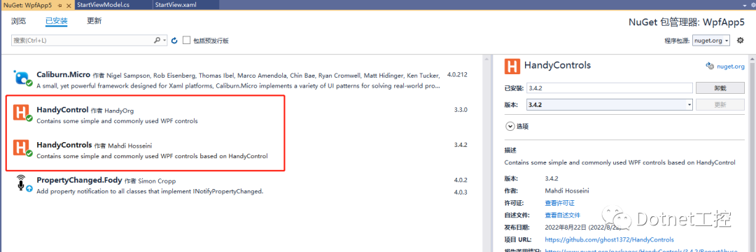
首先还是先在nuget上引用HC的库:.
然后在前台XAML引用:
xmlns:hc="https://handyorg.github.io/handycontrol"在App.xaml中引用HC的皮肤和主题:
<Application.Resources><ResourceDictionary><ResourceDictionary.MergedDictionaries><ResourceDictionary Source="pack://application:,,,/HandyControl;component/Themes/SkinDefault.xaml"/><ResourceDictionary Source="pack://application:,,,/HandyControl;component/Themes/Theme.xaml"/></ResourceDictionary.MergedDictionaries></ResourceDictionary></Application.Resources>
MessageBox用法举例
①对话框
MessageBox.Show("检测到有版本更新,是否更新?", "标题", MessageBoxButton.YesNo, MessageBoxImage.Question);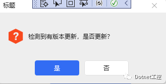
②提示框:
MessageBox.Show("当前选中了:" + listbox.SelectedItem, "标题", MessageBoxButton.OK, MessageBoxImage.Information);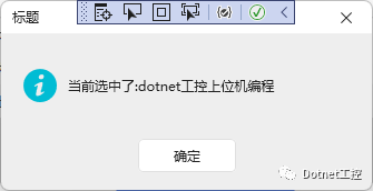
③错误框:
MessageBox.Show("当前选中了:" + listbox.SelectedItem, "标题", MessageBoxButton.OK, MessageBoxImage.Error);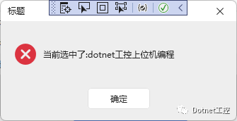
总共有9个枚举量可供选择,分别如下:
//// 摘要:// Specifies the icon that is displayed by a message box.public enum MessageBoxImage{//// 摘要:// The message box contains no symbols.None = 0,//// 摘要:// The message box contains a symbol consisting of white X in a circle with a red// background.Error = 16,//// 摘要:// The message box contains a symbol consisting of a white X in a circle with a// red background.Hand = 16,//// 摘要:// The message box contains a symbol consisting of white X in a circle with a red// background.Stop = 16,//// 摘要:// The message box contains a symbol consisting of a question mark in a circle.// The question mark message icon is no longer recommended because it does not clearly// represent a specific type of message and because the phrasing of a message as// a question could apply to any message type. In addition, users can confuse the// question mark symbol with a help information symbol. Therefore, do not use this// question mark symbol in your message boxes. The system continues to support its// inclusion only for backward compatibility.Question = 32,//// 摘要:// The message box contains a symbol consisting of an exclamation point in a triangle// with a yellow background.Exclamation = 48,//// 摘要:// The message box contains a symbol consisting of an exclamation point in a triangle// with a yellow background.Warning = 48,//// 摘要:// The message box contains a symbol consisting of a lowercase letter i in a circle.Asterisk = 64,//// 摘要:// The message box contains a symbol consisting of a lowercase letter i in a circle.Information = 64}
Button用法举例
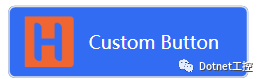
①带图标的button:
<Button Height="48" Width="160" Margin="3" Name="testBtn"Background="{DynamicResource PrimaryBrush}"hc:BackgroundSwitchElement.MouseHoverBackground="{DynamicResource MouseHoverBrush}"hc:BackgroundSwitchElement.MouseDownBackground="{DynamicResource MouseDownBrush}"><Button.Content><Grid><Grid.ColumnDefinitions><ColumnDefinition Width="auto"/><ColumnDefinition/></Grid.ColumnDefinitions><Image Source="pack://application:,,,/Images/icon.ico"/><Label Grid.Column="1" Content="Custom Button" BorderThickness="0" Background="Transparent" Foreground="{DynamicResource TextIconBrush}"/></Grid></Button.Content></Button>
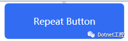
②RepeatButton用法:
<RepeatButton Height="48" Width="160" Content="Repeat Button" Margin="3" Delay="500"Style="{StaticResource RepeatButtonPrimary}" Background="{DynamicResource PrimaryBrush}"Foreground="{DynamicResource TextIconBrush}" hc:BorderElement.CornerRadius="5" Name="RepeatButton_Click"/>
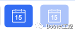
③带有日历图表的button:
<Button Margin="5" Style="{StaticResource ButtonPrimary}" hc:IconElement.Geometry="{StaticResource CalendarGeometry}"/><Button IsEnabled="False" Margin="5" Style="{StaticResource ButtonPrimary}" hc:IconElement.Geometry="{StaticResource CalendarGeometry}"/>
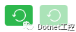
④左旋转又旋转图表button:
<Button Margin="5" Style="{StaticResource ButtonSuccess}" hc:IconElement.Geometry="{StaticResource RotateLeftGeometry}"/><Button IsEnabled="False" Margin="5" Style="{StaticResource ButtonSuccess}" hc:IconElement.Geometry="{StaticResource RotateLeftGeometry}"/>
⑤带左右箭头图标的button:
<Button Margin="5" Style="{StaticResource ButtonWarning}" hc:IconElement.Geometry="{StaticResource LeftGeometry}"/><Button Margin="5" Style="{StaticResource ButtonWarning}" hc:IconElement.Geometry="{StaticResource RightGeometry}"/>

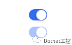
⑥ToggleButton 按钮
<ToggleButton IsChecked="True" Margin="5,8" HorizontalAlignment="Center" Style="{StaticResource ToggleButtonSwitch}" hc:VisualElement.HighlightBrush="{DynamicResource DangerBrush}"/><ToggleButton IsEnabled="False" IsChecked="True" HorizontalAlignment="Center" Margin="5,4" Style="{StaticResource ToggleButtonSwitch}"/>
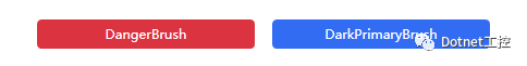
Lable用法举例
<Label Content="DangerBrush" Style="{StaticResource LabelDanger}"/><Label Content="DarkPrimaryBrush" Background="{DynamicResource DarkPrimaryBrush}" Foreground="White" BorderThickness="0"/>
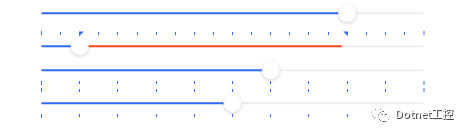
Slider用法举例
<Slider Width="400" IsSnapToTickEnabled="True" Value="8"/><Slider Width="400" IsSnapToTickEnabled="True" TickFrequency="5" Maximum="100" TickPlacement="TopLeft" Value="10" IsSelectionRangeEnabled="True" SelectionStart="10" SelectionEnd="80"/><Slider Width="400" hc:TipElement.Visibility="Visible" hc:TipElement.Placement="Top" IsSnapToTickEnabled="True" Maximum="100" Value="60" TickFrequency="10" TickPlacement="BottomRight"/><Slider Width="400" hc:TipElement.Visibility="Visible" hc:TipElement.Placement="Bottom" hc:TipElement.StringFormat="#0.00" Value="5" TickPlacement="Both"/>
TextBox用法举例
<TextBox Margin="0,0,0,32" hc:InfoElement.TitleWidth="70" hc:InfoElement.Placeholder="Necessary" hc:InfoElement.TitlePlacement="Left"hc:InfoElement.Title="Left title" hc:InfoElement.Necessary="True" Style="{StaticResource TextBoxExtend}" Name="TextContent"/>

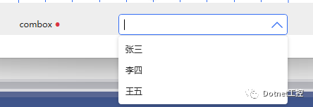
组合框ComboBox用法举例
<ComboBox IsEditable="True" Width="380" hc:InfoElement.TitleWidth="140" hc:InfoElement.TitlePlacement="Left" hc:InfoElement.Title="combox" hc:InfoElement.Necessary="True" Style="{StaticResource ComboBoxExtend}" Margin="0,16,0,0"><ComboBoxItem>张三</ComboBoxItem><ComboBoxItem>李四</ComboBoxItem><ComboBoxItem>王五</ComboBoxItem></ComboBox>
还有很多基本控件,限于篇幅本节就讲到这里,要想深入学习了解还是得下载源代码去探索调试.
源码下载
链接:https://pan.baidu.com/s/1Rdx43-8Aa21gl_YPsh6ncg
提取码:6666
本文参考链接:https://github.com/HandyOrg/HandyControl