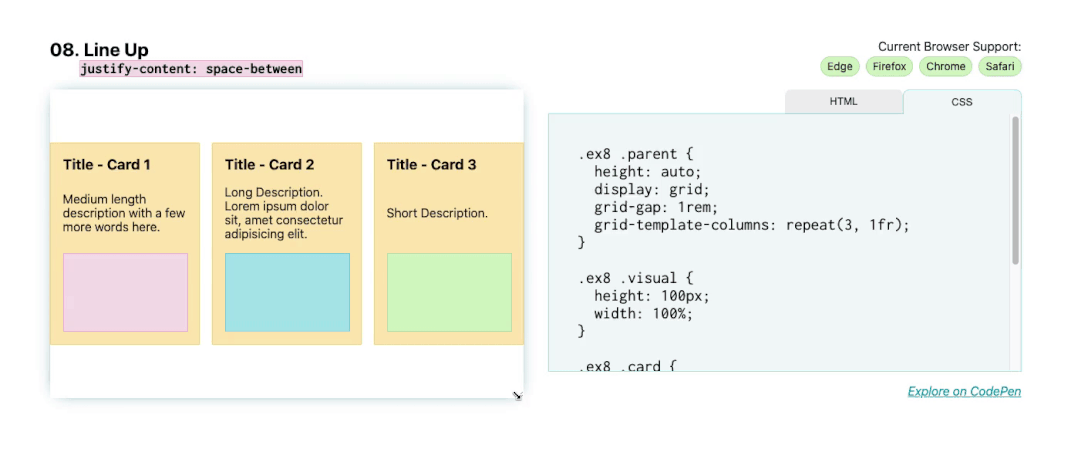
对于下一个布局,这里要主要说明的是 justify-content: space-between ,它将第一个和最后一个子元素放置在其边界框的边缘,其余空间均匀分布在元素之间。对于这些卡片,它们被放置在 Flexbox 显示模式中,使用 flex-direction: column 将方向设置为 column。.
这会将标题、描述和图像块放在父卡片内的垂直列中。然后,应用 justify-content: space-between 将第一个(标题)和最后一个(图像块)元素锚定到 flexbox 的边缘,并且它们之间的描述性文本以相等的间距放置到每个端点。
.parent {
  display: flex;
  flex-direction: column;
  justify-content: space-between;
}
演示:https://1linelayouts.glitch.me/